

The Most Common Accessibility Issue Isn't Complex. It's Color Contrast.
When organizations begin improving website accessibility, they often expect the biggest challenges to involve screen readers, keyboard navigation, or complex technical audits.
In reality, one of the most common accessibility issues is much simpler: insufficient color contrast.
It appears on landing pages, checkout flows, contact forms, dashboards, blogs, and mobile interfaces. Not because teams ignore accessibility, but because color decisions happen throughout the entire product lifecycle.
How Color Contrast Issues Sneak Into Modern Websites
A design system launches with accessible colors.
Six months later, marketing creates a campaign page with a new background.
Another team adds promotional banners.
A developer introduces a disabled button state.
A CMS editor changes the text color to better match a seasonal theme.
Individually, these changes seem harmless. Collectively, they create dozens of new color combinations that were never reviewed for accessibility.
That's how color contrast issues appear, even on well-designed websites.
Accessibility Is a Design Quality Issue
Poor color contrast is often discussed as a compliance problem, but it's fundamentally a usability problem.
If users struggle to distinguish text from its background, they spend more time trying to understand your interface instead of completing their task.
This affects far more people than many organizations realize, including:
-
People with low vision.
-
Users with color vision deficiencies.
-
Older adults experiencing natural vision changes.
-
Mobile users outdoors in bright sunlight.
-
Anyone viewing a screen with reduced brightness or glare.
Readable content creates a better experience for every visitor.
Design Systems Reduce Risk, Not Responsibility
Design systems help standardize components, typography, and brand colors, but they cannot guarantee accessibility over time.
Interfaces evolve.
New pages are published.
Components are reused in different contexts.
Brand campaigns introduce temporary visual styles.
Every new foreground and background combination should be reviewed, regardless of whether it originates from the original design system.
Accessibility is maintained through continuous review, not a one-time approval.
Small Changes Often Deliver the Biggest Improvements
Organizations sometimes postpone accessibility because they assume it requires a complete redesign.
Color contrast proves the opposite.
Improving text readability often requires only small adjustments to foreground or background colors while preserving the overall visual identity.
These incremental improvements make interfaces easier to read without changing the brand experience users recognize.
Make Contrast Reviews Part of Every Release
The most effective teams don't wait until an accessibility audit identifies problems.
Instead, they include contrast validation as part of their normal design and development workflow.
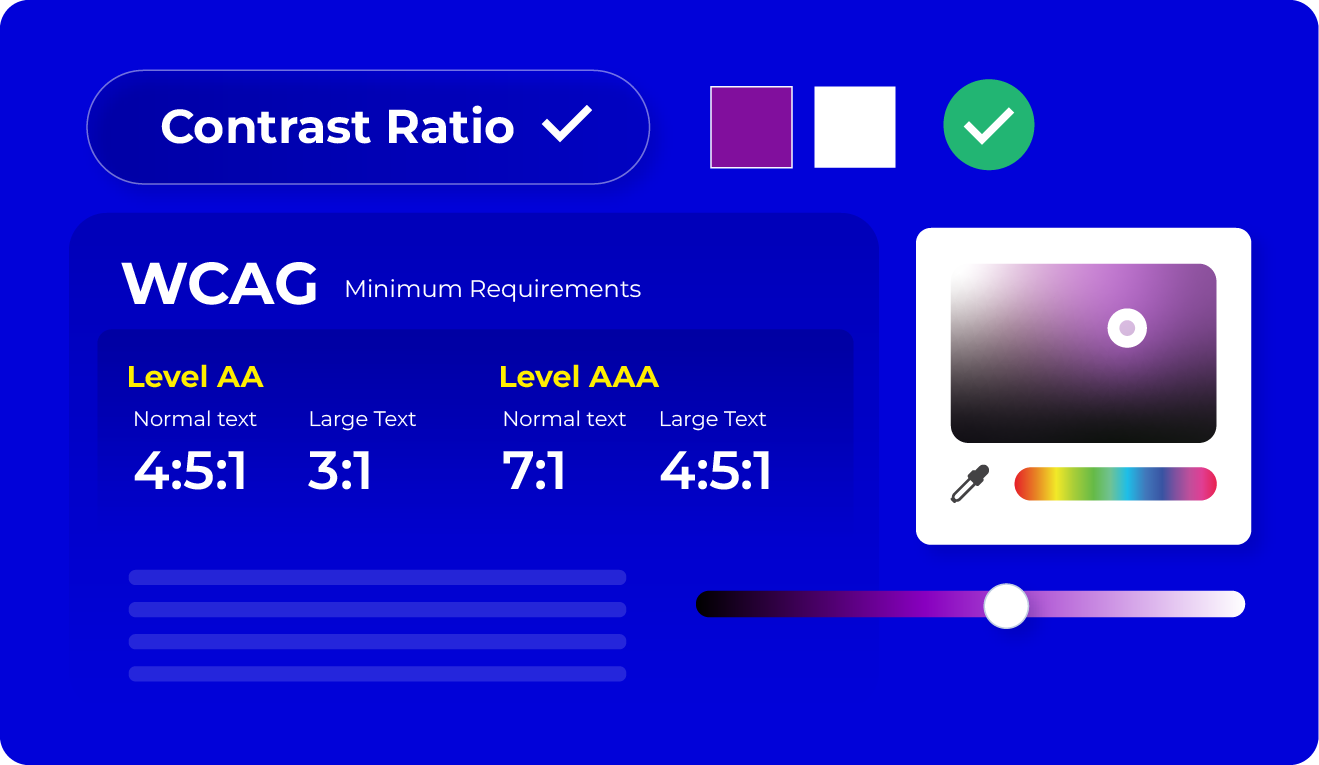
Before publishing new pages, updating components, or launching campaigns, designers and developers can quickly verify whether text and background colors satisfy the minimum contrast requirements defined by WCAG. Using a Color Contrast Checker during this review helps identify potential readability issues before they reach users.
Building accessibility into everyday workflows is significantly more efficient than correcting issues after deployment.
Final Thoughts
Color contrast remains one of the most common accessibility issues because websites never stop evolving.
Designs change.
Content changes.
Brands evolve.
Without regular validation, even accessible websites gradually develop readability problems.
Accessibility is not achieved through a single audit. It's maintained through consistent design decisions that prioritize clarity, readability, and usability for every visitor.
- Digital Agency
- Literie
- Location de voitures
- Restaurant
- Restaurant
- Mode
- Mode
- Information
- Marketing
- Tourisme
- Développement
- Découverte
- Législation
- Gastronomie
- Pâtisserie
- Evento
- Art
- Causes
- Crafts
- Dance
- Drinks
- Film
- Fitness
- Food
- Juegos
- Gardening
- Health
- Inicio
- Literature
- Music
- Networking
- Otro
- Party
- Religion
- Shopping
- Sports
- Theater
- Wellness
 Spanish
 Indian
 English
 French
 Arabic
 Portuguese
 Deutsch
 Turkish
 Dutch
Dutch
 Italiano
 Russian
 Romaian
 Portuguese (Brazil)
 Greek
Greek